I brought together data from across the business - ordering, supply, commercial and support - into a single Power BI dashboard, analysing it to surface insights and connections that had not been seen before.
The Opportunity
Across the business, useful information sat in separate places: ordering and sales data, supply and delivery data, commercial terms, and customer support, each living in its own system, extract or spreadsheet. No one had looked at it all together, cross-referenced it, or drawn out the links between it. Where connections had been made, they were not shared across the business in a meaningful, collaborative way, and the data itself was awkward to share, scattered across Excel files and system extracts.
I saw an opportunity to bring it into one place and analyse it properly.
Project Scope
The aim was to pull the relevant data from each source into a single, connected model, then analyse it as a whole rather than in isolation, looking for the patterns, links and gaps that only show up when the data sits side by side. Just as important was presenting the findings so that anyone in the business could pick them up and act on them, rather than producing yet another spreadsheet to wade through.
Solution Implemented
I built a multi-page Power BI dashboard that brings data from across the business into one connected model, and lets you deep-dive from a high-level overview right down to individual stores, products and orders.
The report covers the areas that matter to how the business runs, including:
Overview - the store estate, order volumes and headline measures in one place
Product and category demand - the most and least ordered lines, by area
Ordered vs delivered - where what was ordered did not match what actually arrived, and what the difference in value.
Cancellations and shortages - the volumes and the reasoning behind them.
Commercial charges and claims - where charges applied, and the claims raised against deliveries.
Customer support - helpdesk demand, by store and by reason.
With everything in one place I could cross-reference the information, make the connections that had been missing, and present the findings in a clear, consistent, easy-to-consume format - so the analysis is shared across the business rather than locked in one person's spreadsheet.
The dashboard images show an anonymised representation of this project. All data, product names, store references and figures have been replaced.
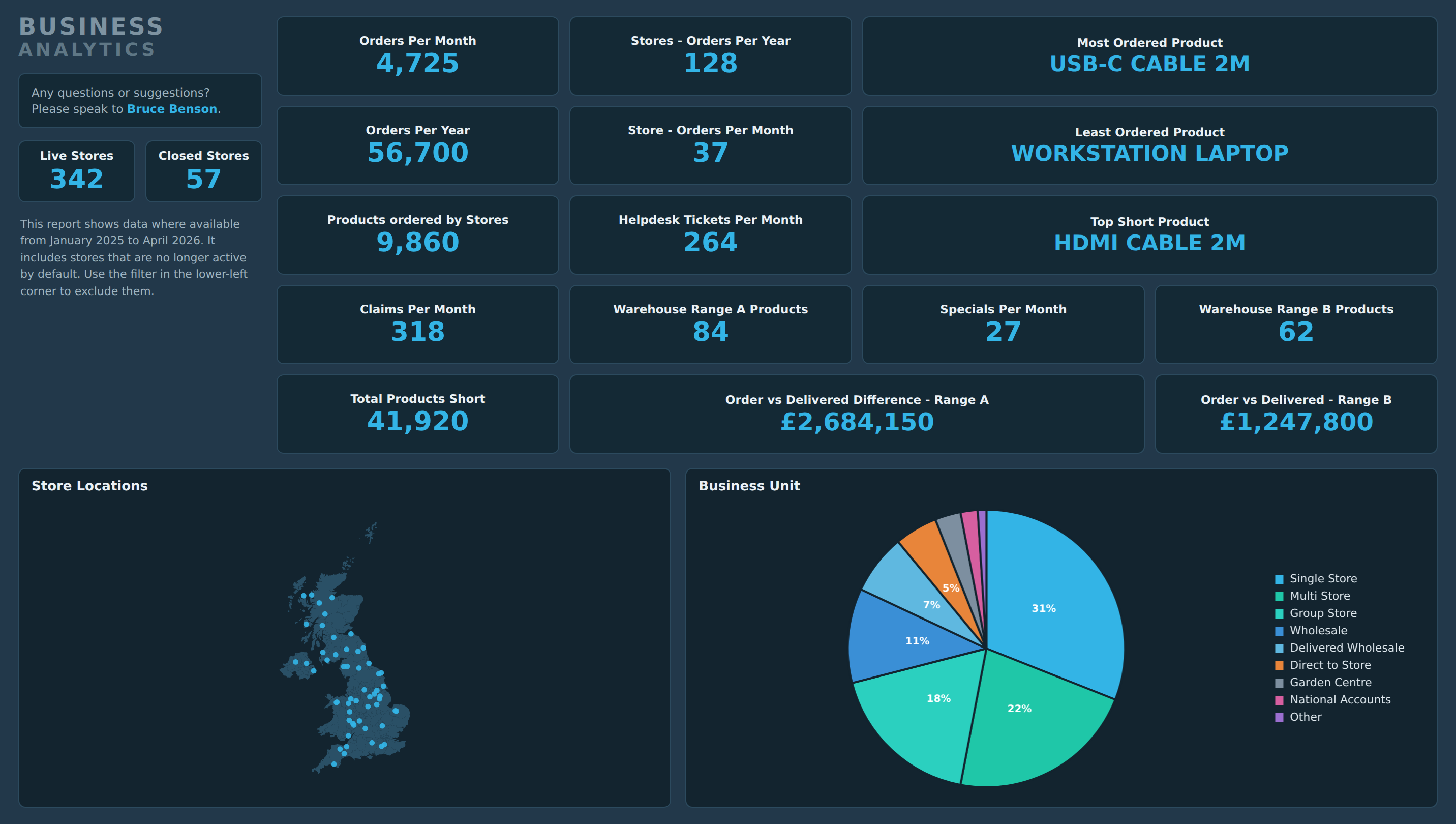
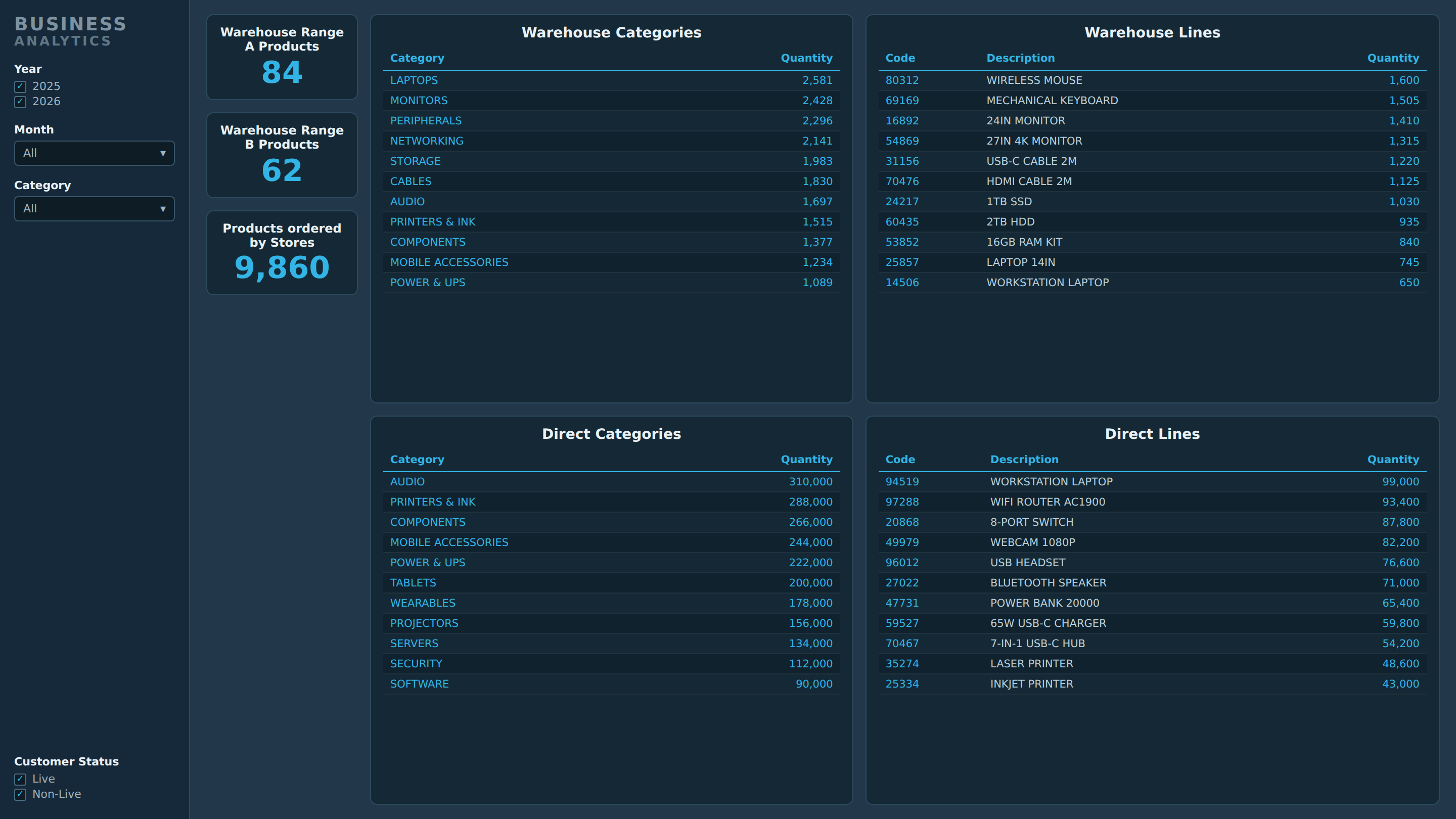
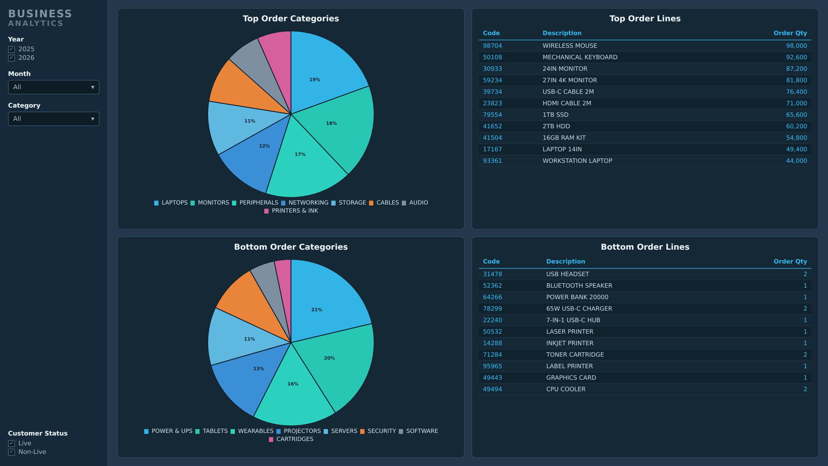
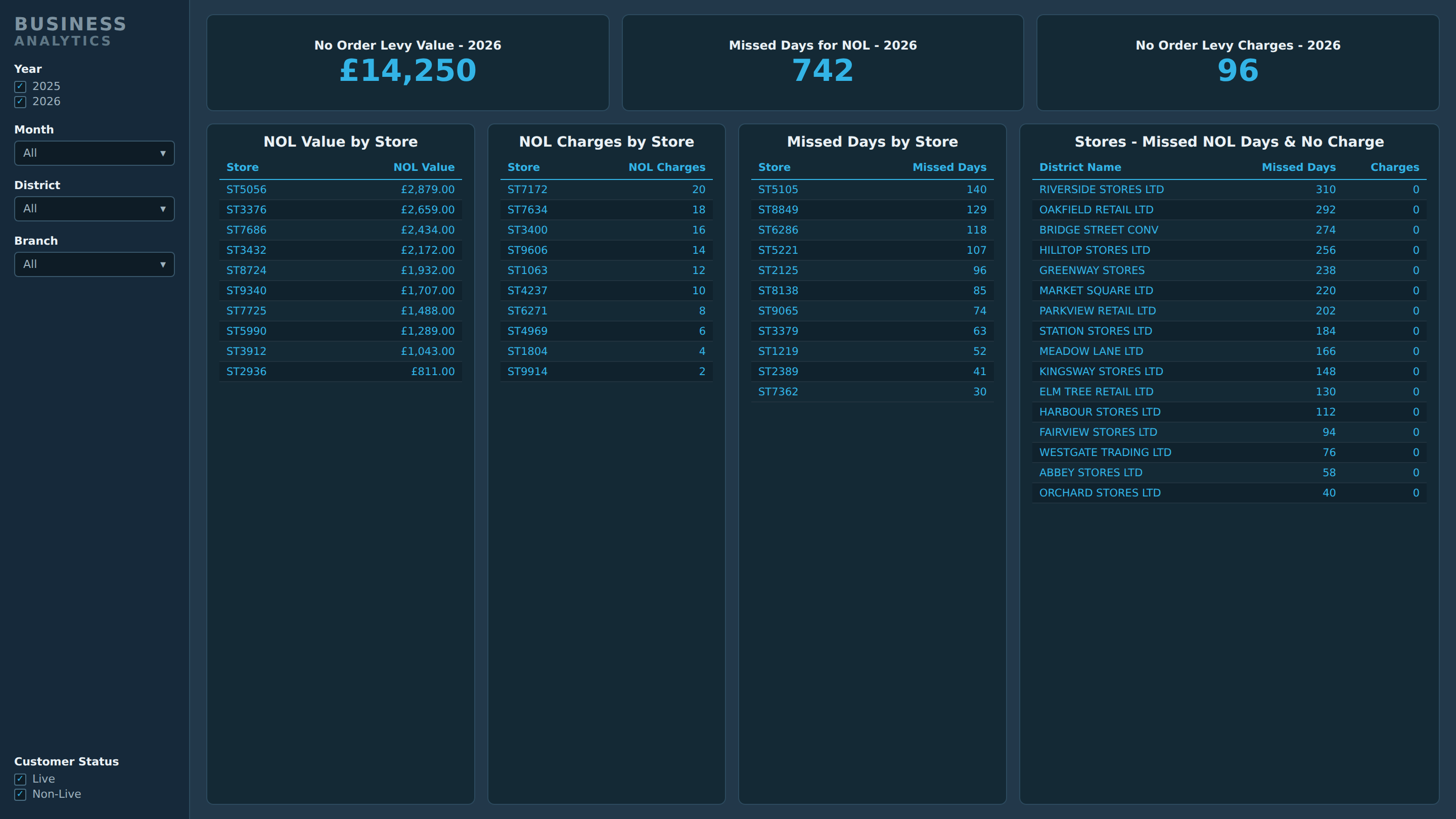
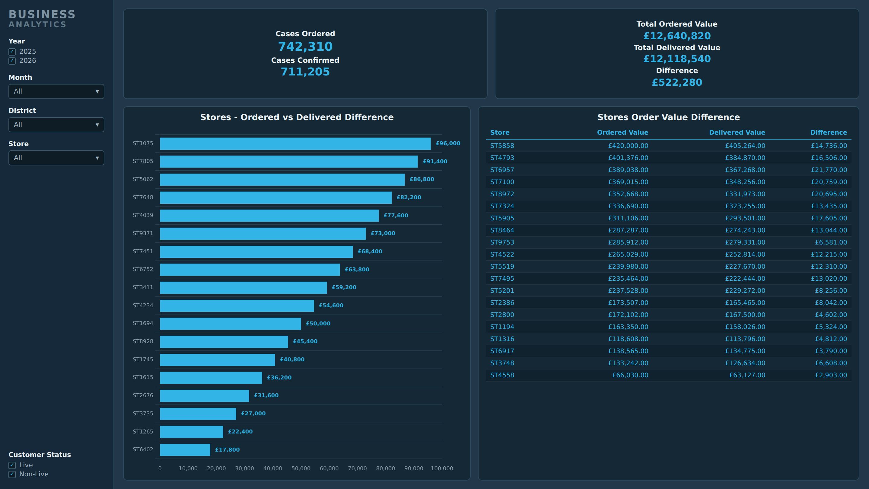
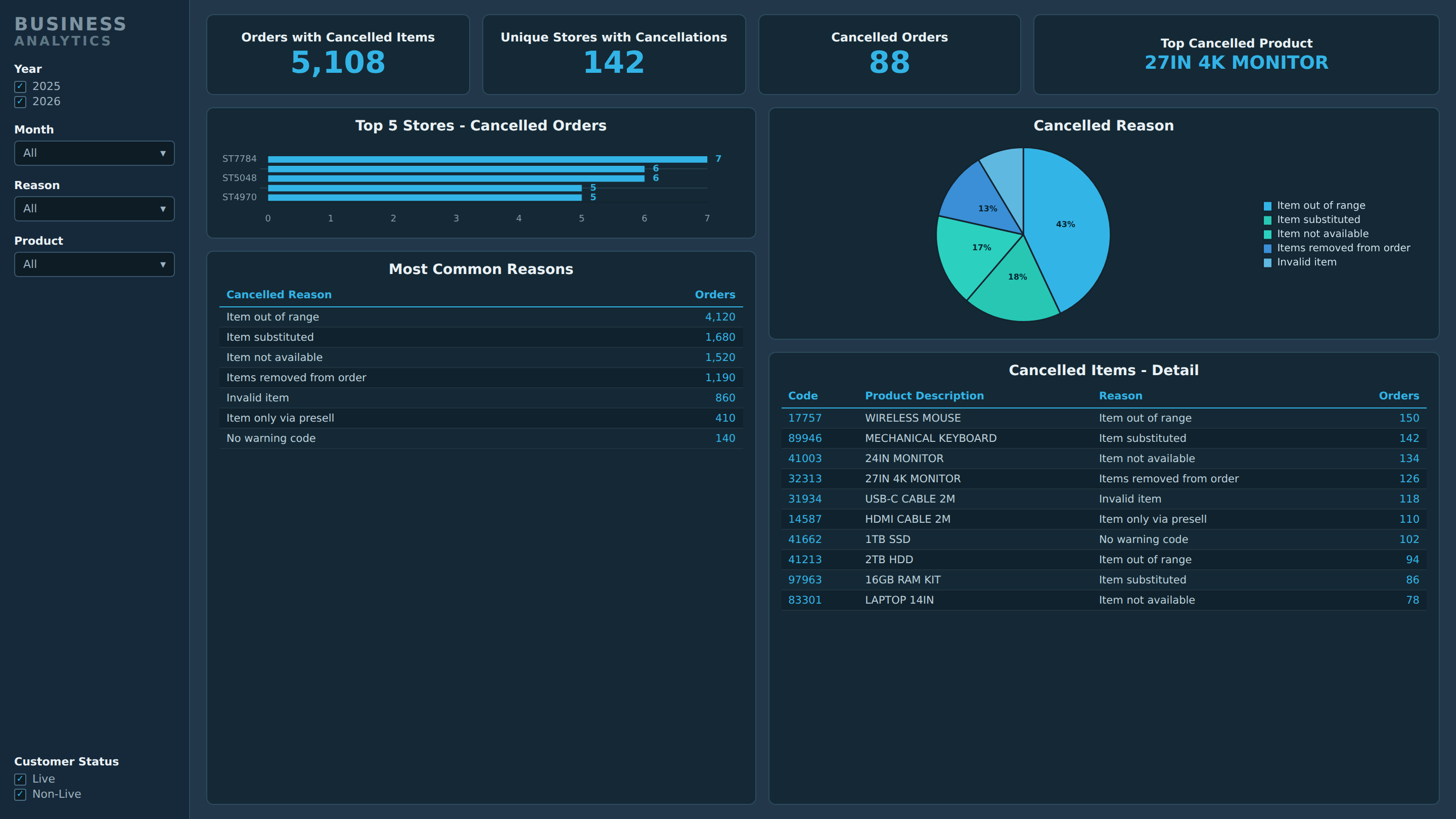
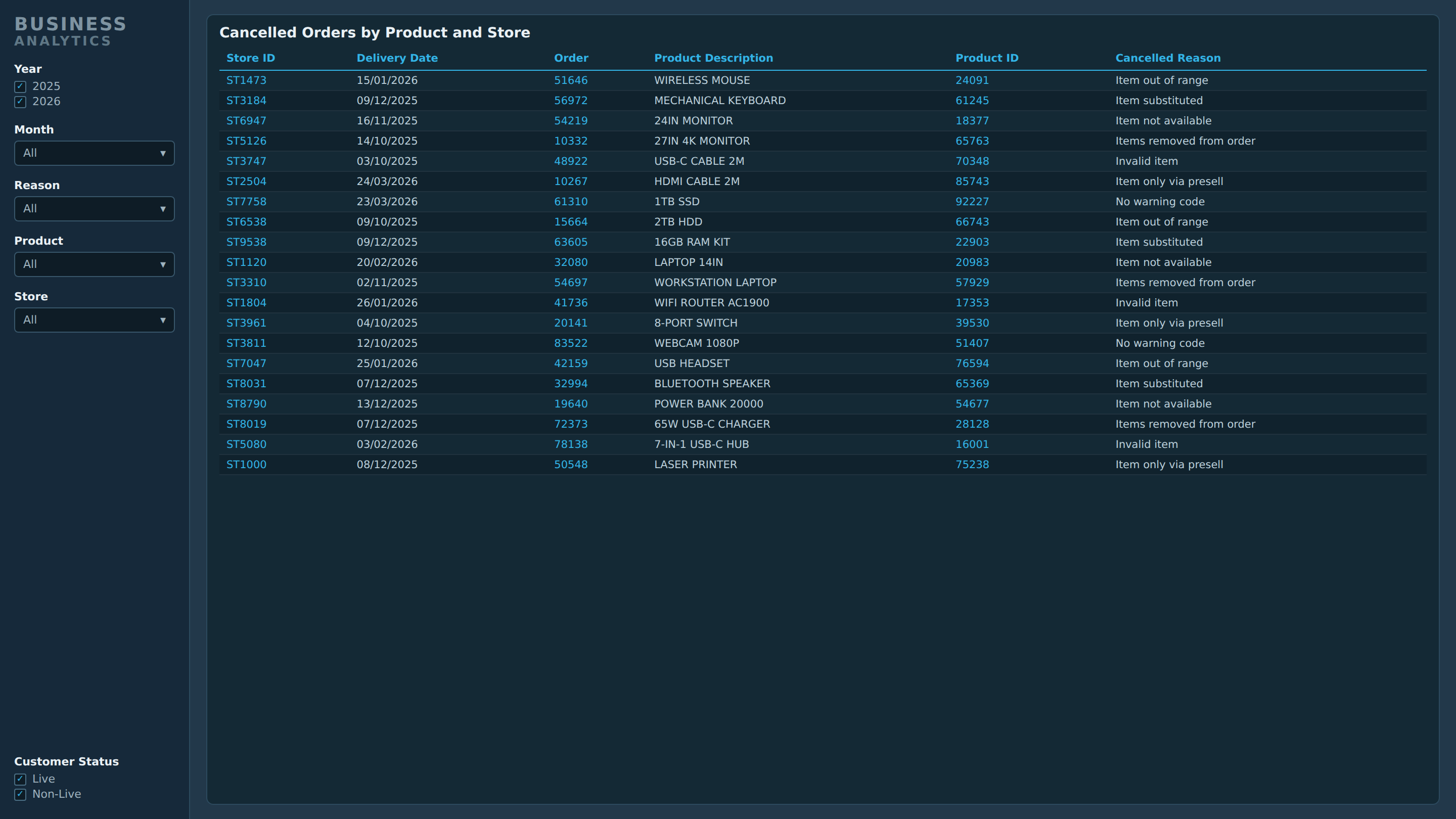
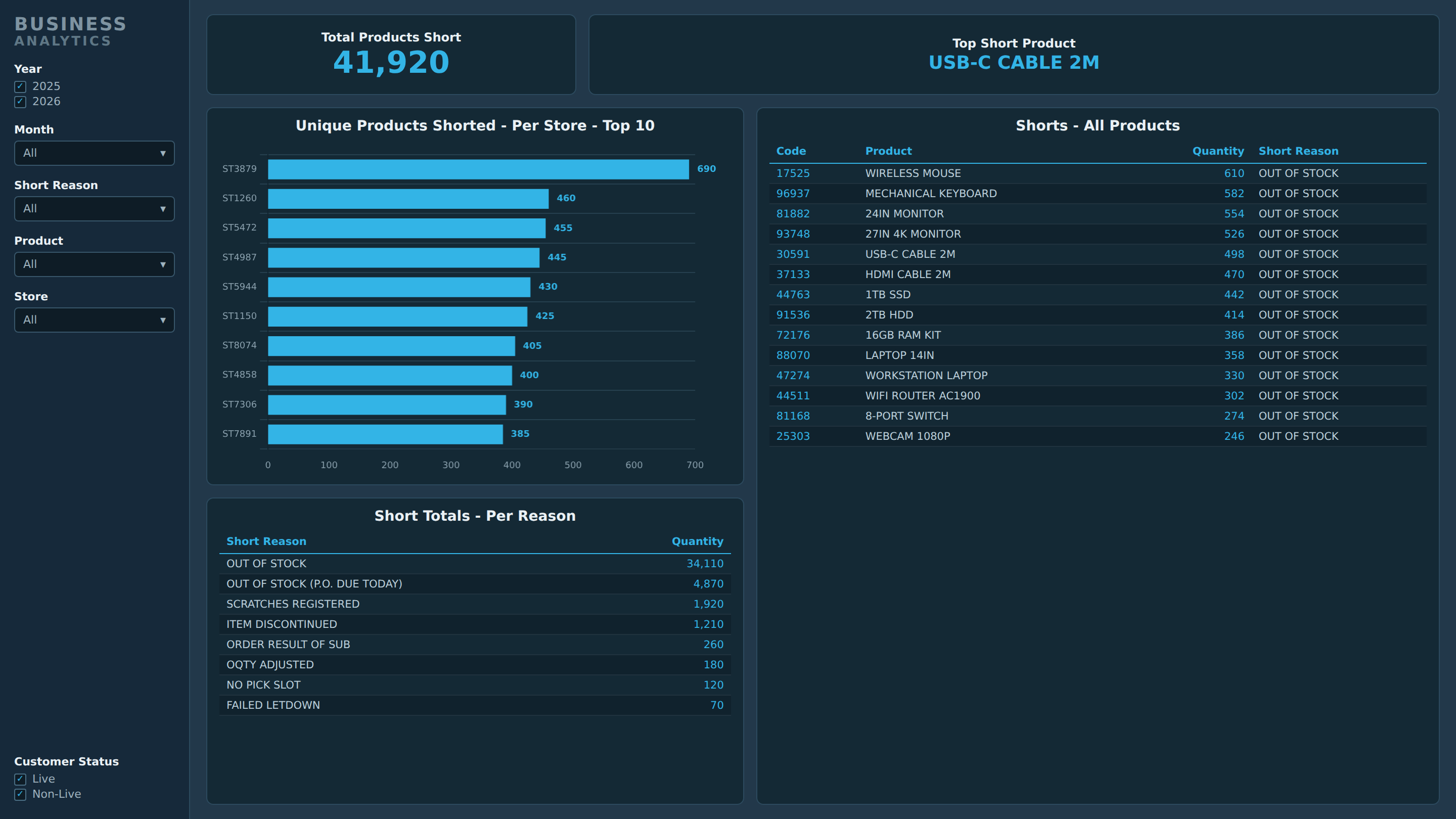
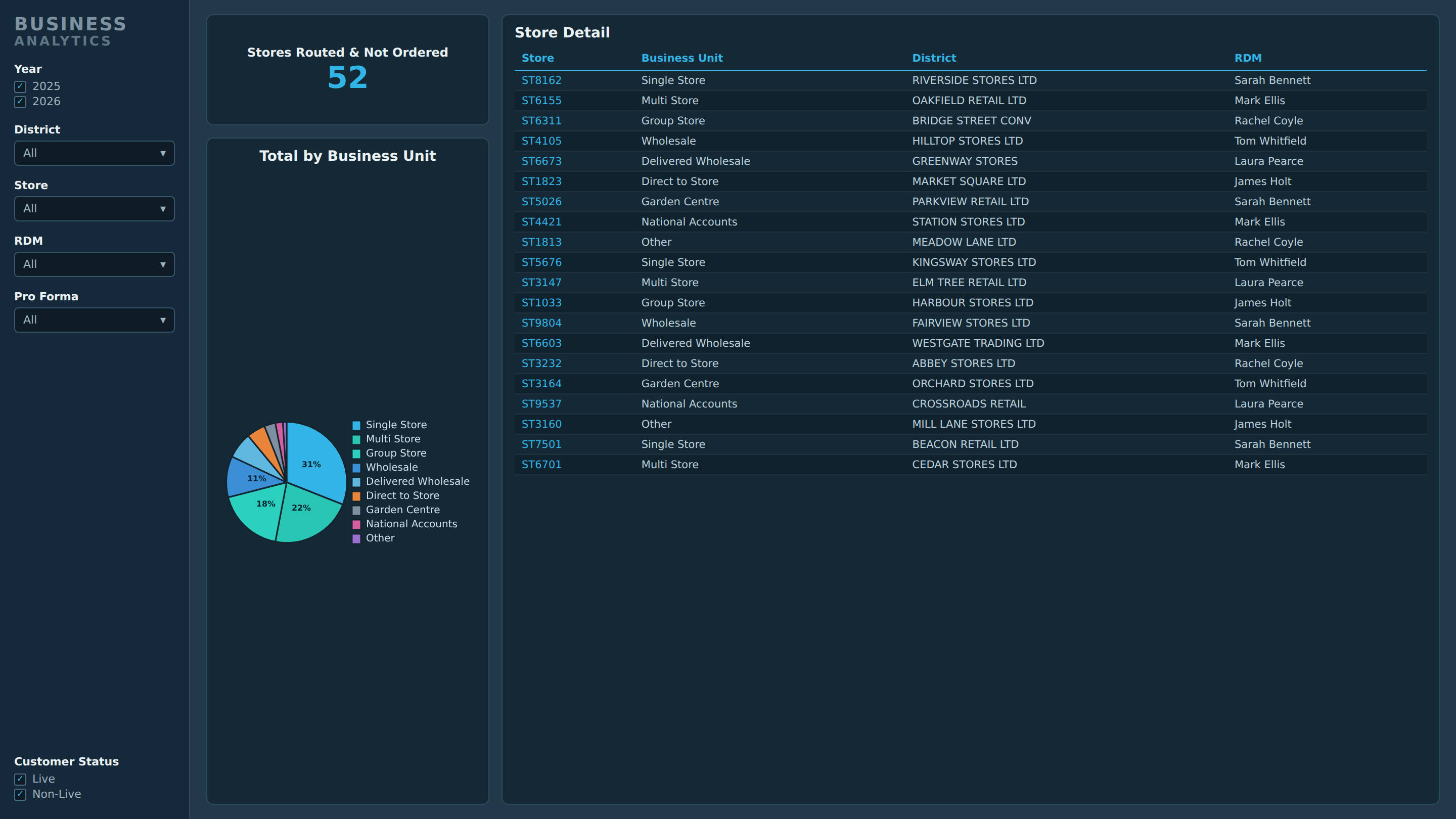
These images only show a general representation of the final project. All data, references and names have been replaced.
Impact & Outcomes
Bringing the data together has already helped identify areas to target in resolving issues across the business, along with specific sales opportunities and misalignments that were not obvious before. Patterns that were invisible while the data stayed in separate extracts became clear once it all sat side by side. The result turned scattered extracts into a shared, practical view that people can use to make decisions.
Lessons Learned & Next Steps
The biggest lesson was that the real value sat in how the data was joined together behind the scenes, not in the charts on top. Most of the effort went into cleaning each source and connecting it through a few shared reference points - stores, products and dates - so that everything lined up and could be compared properly. Once that foundation was right, the analysis and the visuals came together quickly. It was a good reminder that the unglamorous groundwork is what makes a report reliable and able to grow.
From here, I want to keep building my Power BI skills in a few clear directions:
- Stronger foundations - getting even better at structuring the underlying data so reports stay fast and accurate, and are easy to extend as more sources are added.
- Deeper analysis - growing the range of calculations and techniques I can use, so the dashboard can answer more questions and surface more patterns.
- More automation - connecting straight to the source systems so the data refreshes itself, removing the manual exports and spreadsheets entirely.
- Better sharing - building it so different parts of the business can safely work from the same trusted figures, rather than everyone keeping their own version.
- Keeping current - learning Microsoft's newer data tools and working toward recognised Power BI certifications, to keep my skills sharp and formally backed.
The aim is to turn this from one good report into a reusable, well-built foundation the wider business can rely on and grow with.