The Request
The Service Desk is the single point of contact between the IT department and the wider business, handling day-to-day IT support across the organisation. Each month, performance figures were pulled together by hand: the numbers were taken from the ticketing system manually and used to update an Excel workbook and a PowerPoint deck. It worked, but it was time-consuming, repetitive, and only ever as current as the last manual update.
I was asked to give the Service Desk Manager a clearer, faster view of team performance, without the monthly manual effort.
Project Scope
The aim was to replace the manual monthly compile with a single, live report that drew straight from the systems already in use, so the figures were always current and no one had to rebuild them by hand.
Two data sources covered what was needed:
- The ITIL-based ITSM platform (TopDesk), for incident, request and asset data
- The device management platform (Microsoft Intune), for enrolment and device data
From there I mapped out the views that mattered to the team and the manager: incident volumes and trends, SLA performance, how tickets were being logged, the most common categories, priority-1 handling, and a monthly people-and-device snapshot.
Solution Implemented
I built a multi-page Power BI report connected to both sources via API, with a consistent branded theme, a sidebar for navigation, and KPI cards for the headline figures. A scheduled refresh keeps it current, with the last refresh time shown on screen.
The report is organised into focused pages:
- Home - an overview of the dashboard's purpose, the team, and the data sources.
- Live - same-day and current-month activity, including today's incidents, the month-to-date trend, and today's categories.
- Last Week - a weekly view: incidents logged per hour, entry method, SLA resolution and response compliance, daily volume, and top categories.
- Monthly - the monthly equivalent, with longer-run volume trends and category breakdowns.
- Monthly - At a Glance - a single-screen snapshot: joiners, leavers and movers, device enrolments, incidents resolved, target achievement, and year-on-year volume.
- All Time - long-run trends, year-on-year volume, all-time categories and entry methods.
- P1 Incidents - priority-1 tracking, including SLA performance, response time, and average time in progress.
- Single Department Focus - a dedicated breakdown for a single high-demand area requiring agile and responsive support.
Behind the visuals, measures handle the calculations the team would otherwise work out by hand: SLA resolution and response compliance, year-on-year volume, average time in progress for priority-1 incidents, per-hour distribution, and the joiner, leaver and mover counts.
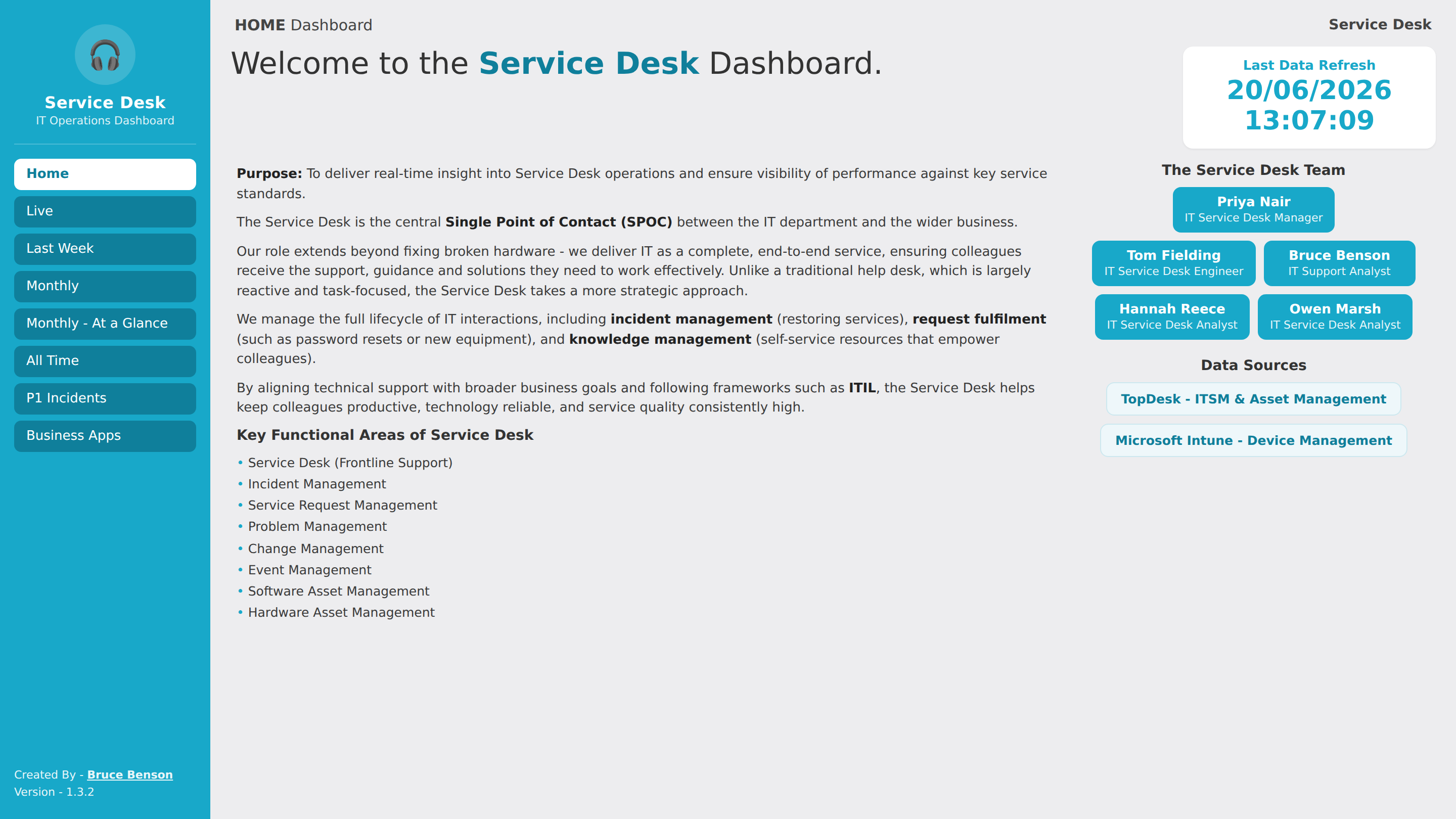
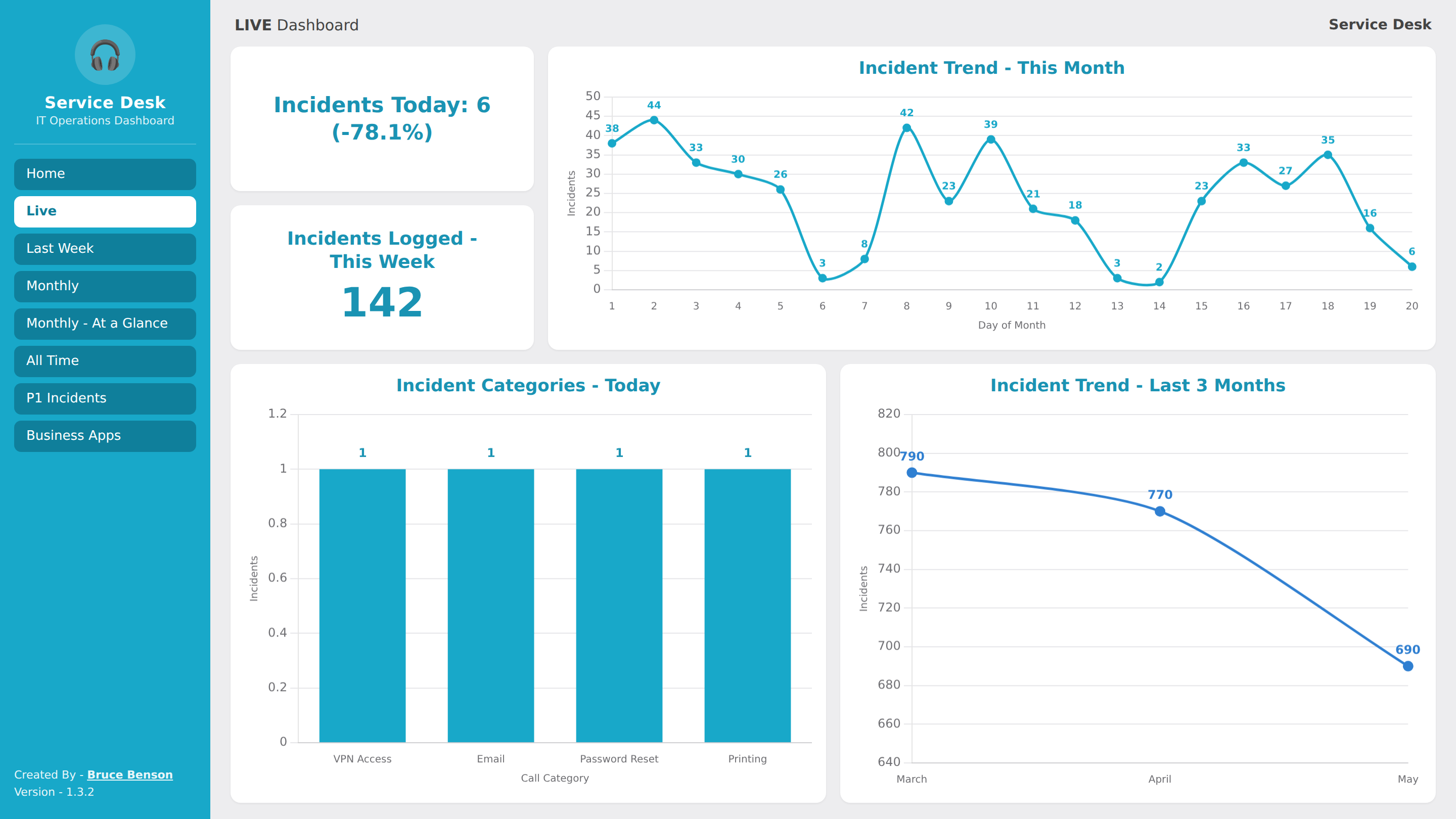
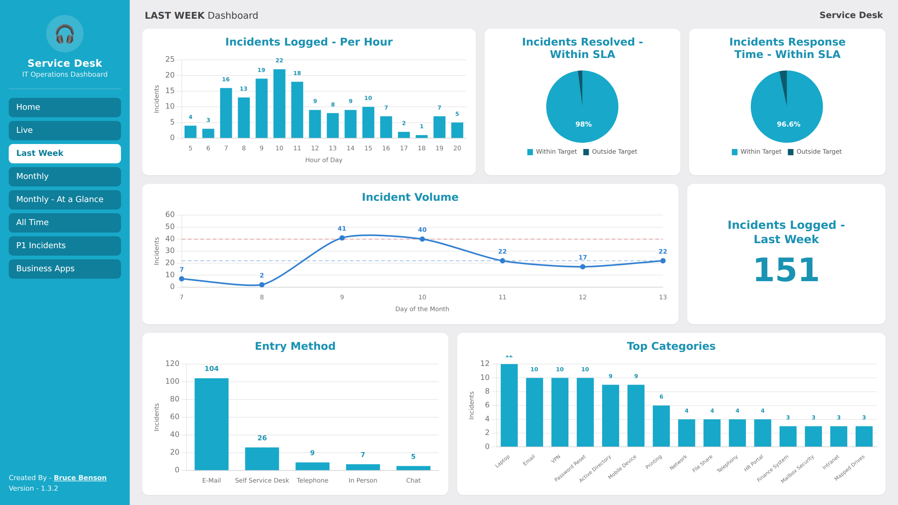
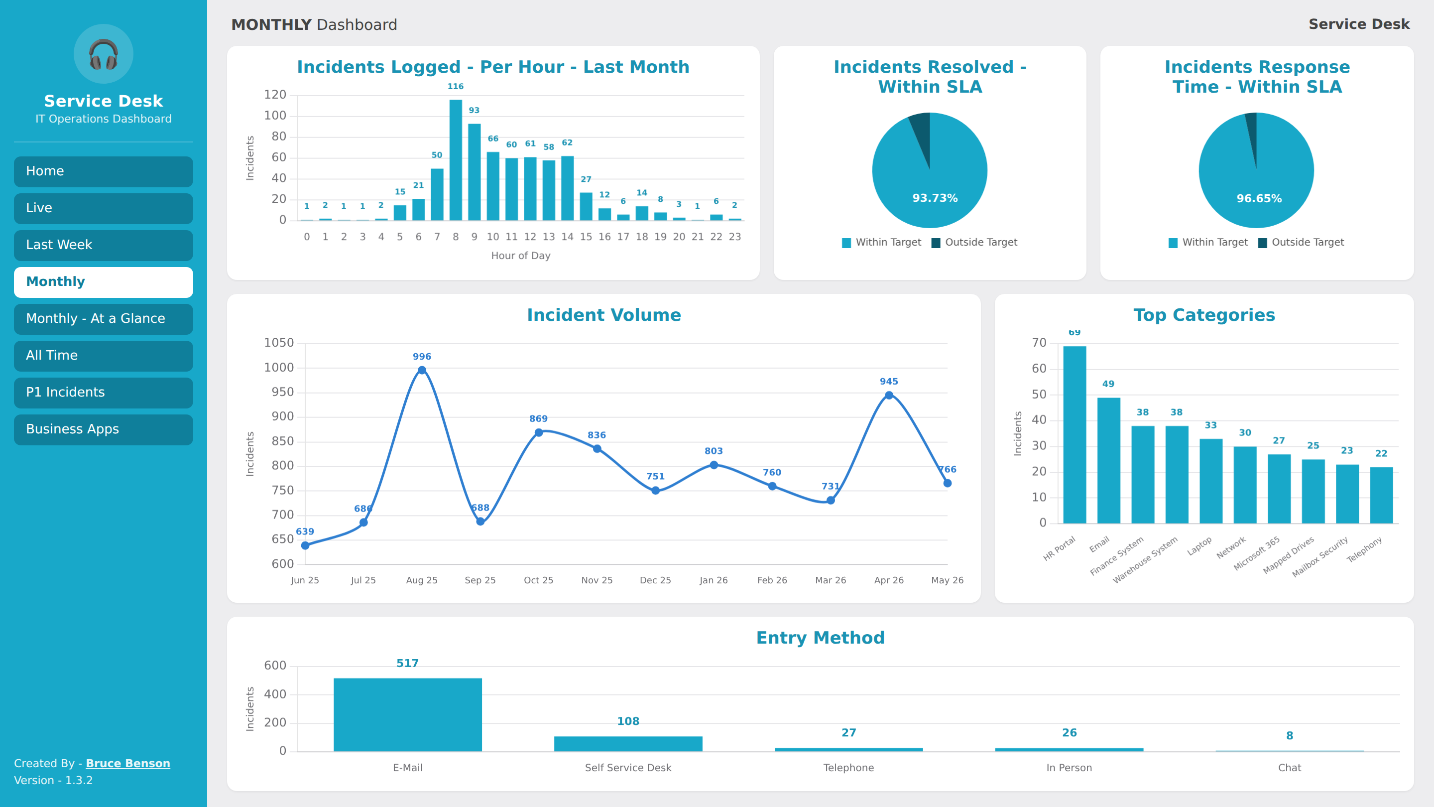
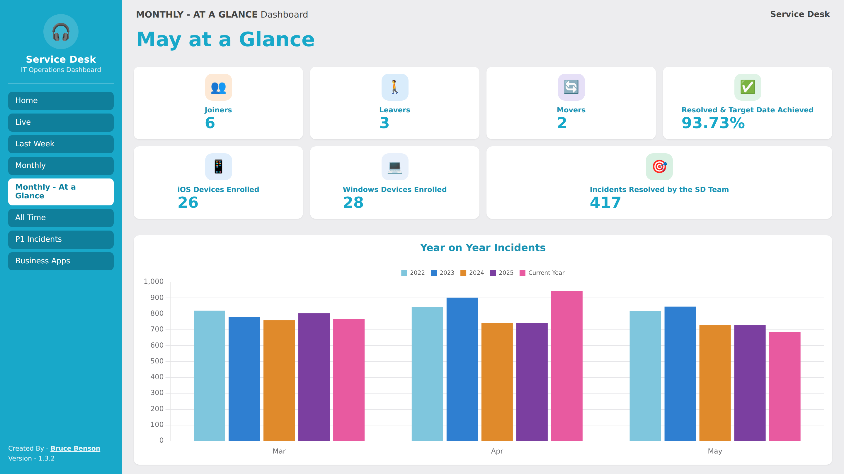
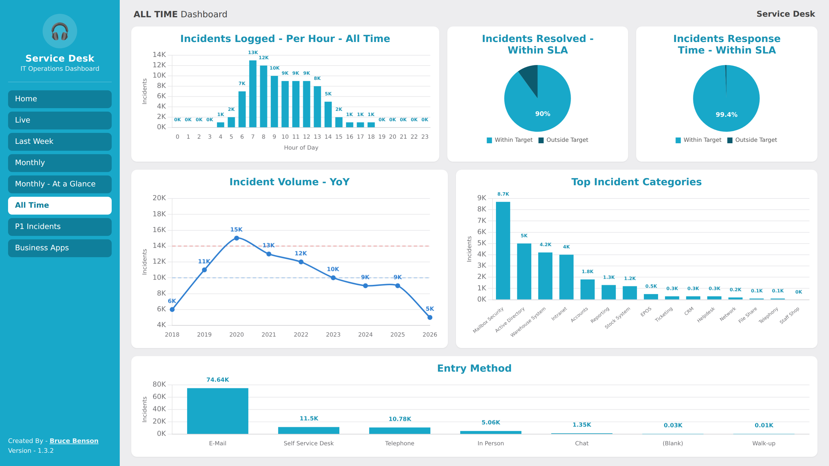
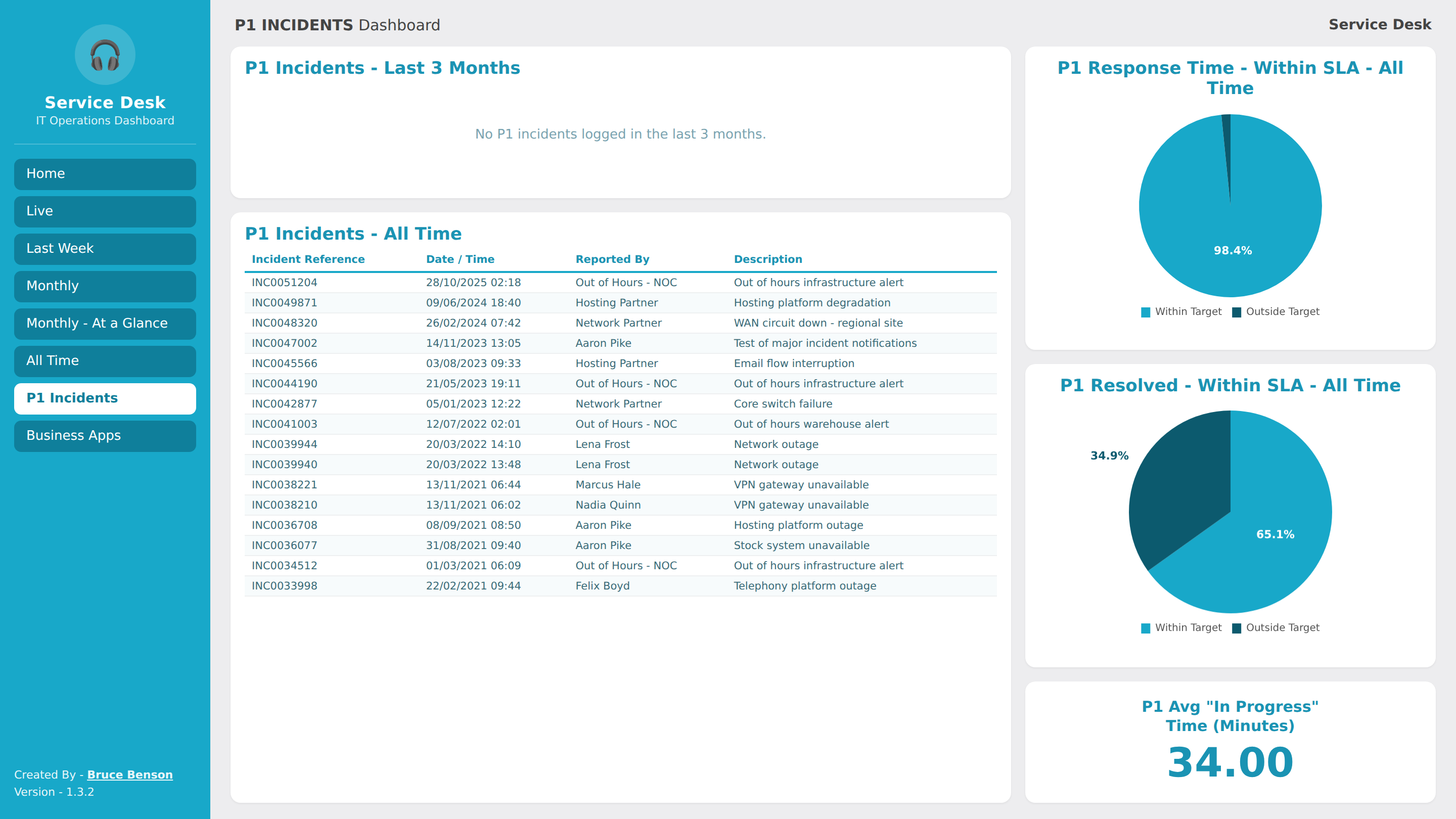
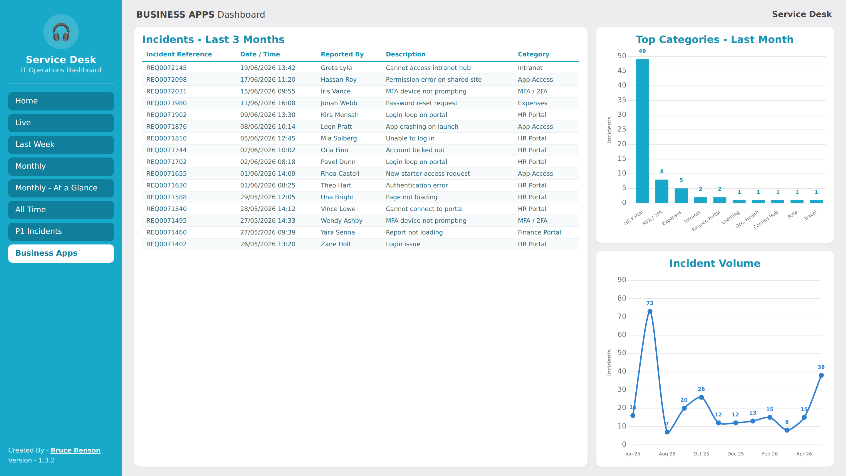
These images only show a general representation of the final project. All data, references and names have been replaced.
Lessons Learned & Next Steps
The immediate win was removing a recurring manual task: what had been a monthly exercise in Excel and PowerPoint is now available the moment the report is opened, and it is always up to date.
The less expected benefit was what the data surfaced once it was all in one place. Patterns that were not obvious before became visible - peak logging hours, the most frequently logged categories and systems, and recurring request types - giving the team a clearer steer on where to focus effort and where problem management or self-service could reduce demand.
The next step is to keep improving the report - finding the meaningful parts of the data and using them to improve the Service Desk and the IT support we provide to the business. It is not just about saving time on compiling the report. The bigger gain is using the data to identify recurring issues, carry out root cause analysis, and resolve them at source, cutting the repeat demand that drives a lot of tickets. That frees up time across the whole Service Desk team for more meaningful tasks and development, in line with the ITIL Continual Service Improvement way of working.